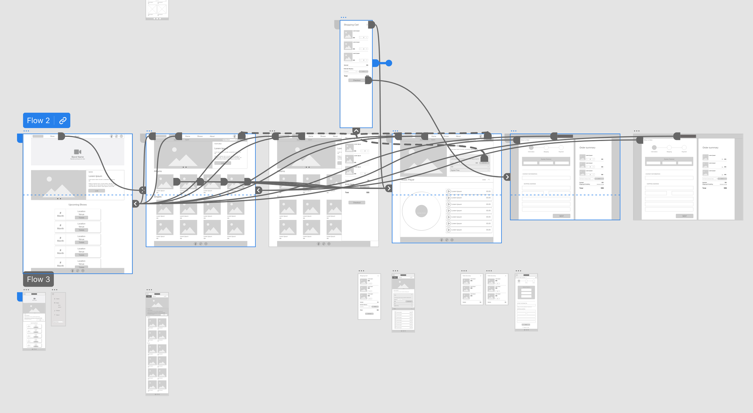





Low-fi Prototype
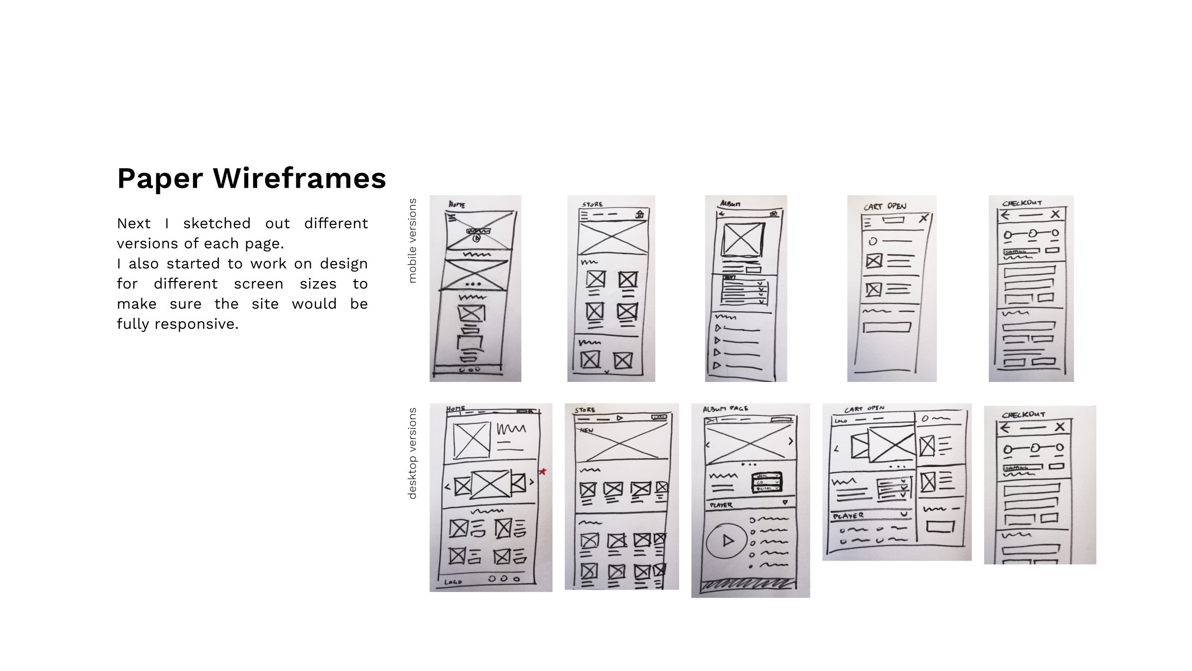
To achieve a working Prototype I connected all pages necessary to complete the user flow of visiting the store, adding an item to the cart and checking out.


Updating the Design
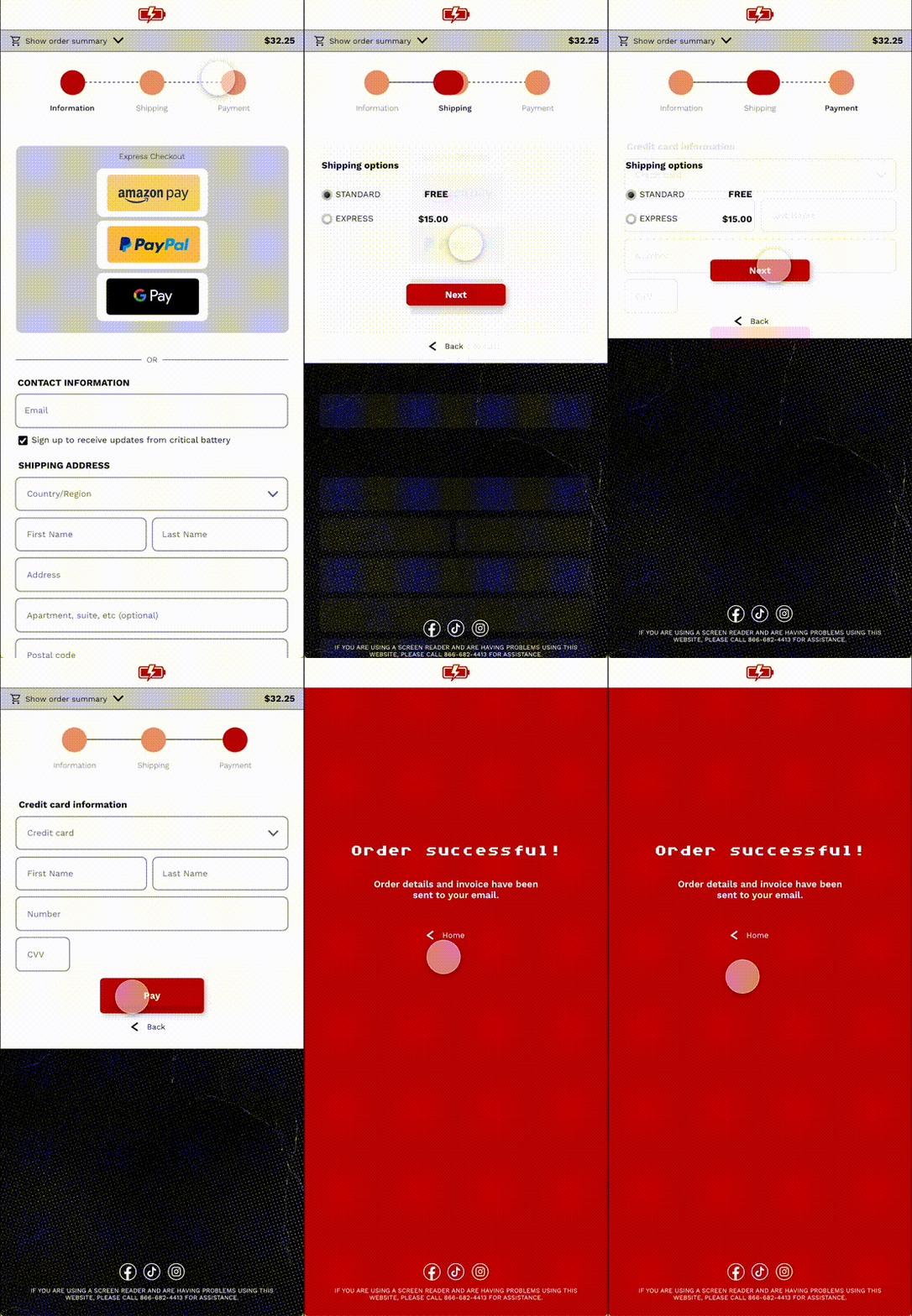
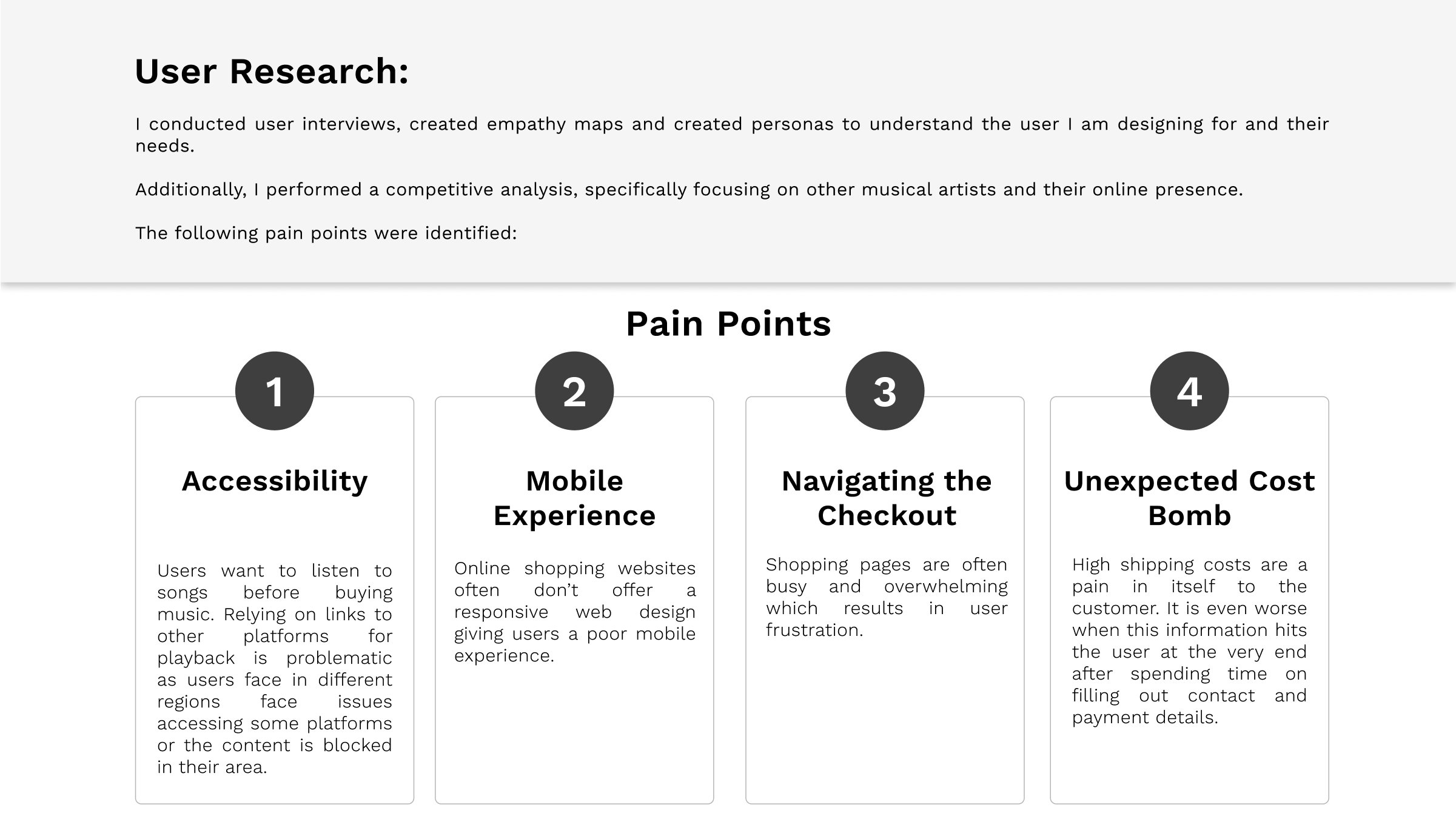
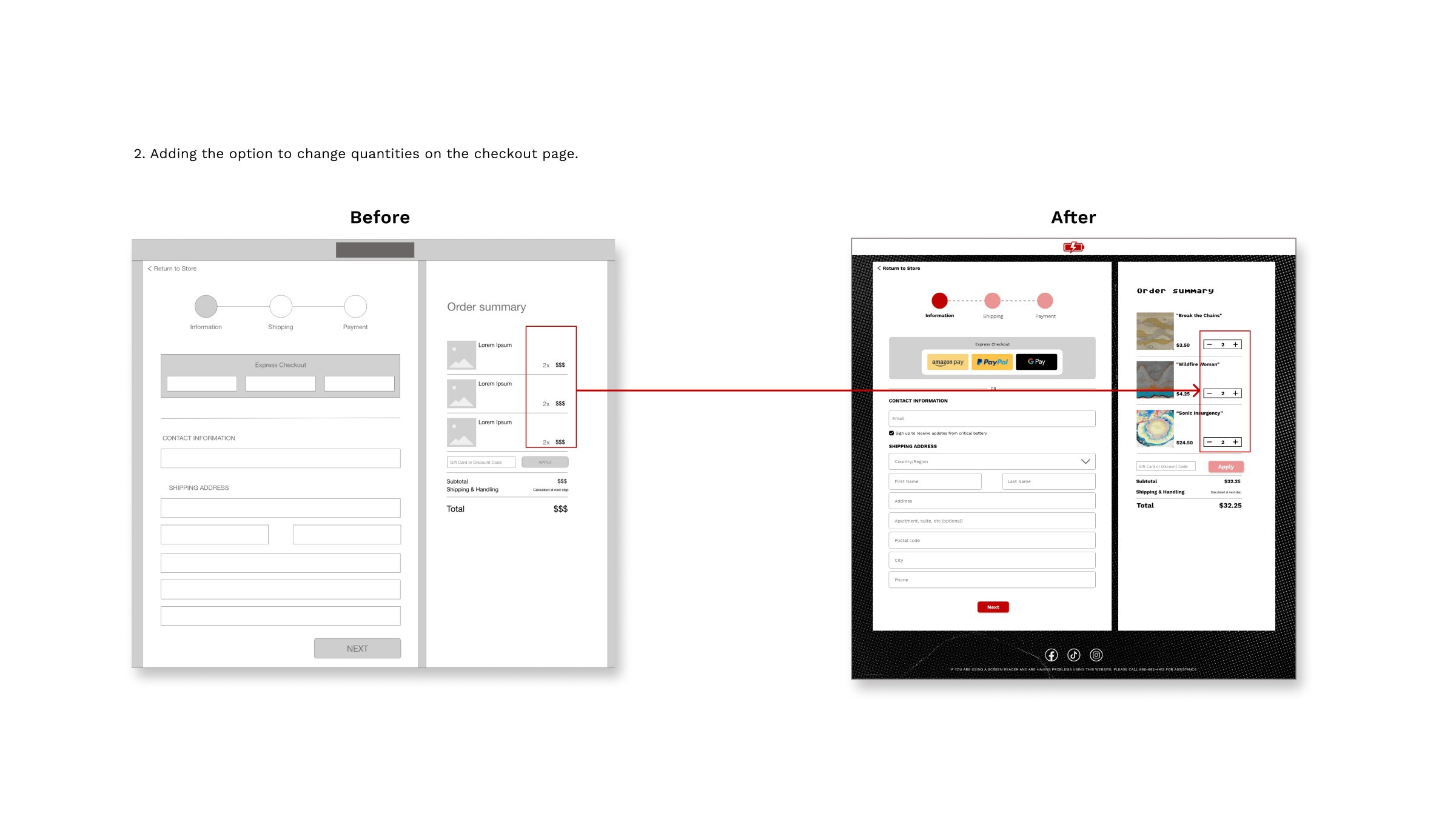
Based on user feedback I completely overhauled the checkout process. My main objective was to give the user guidance in the process to create trust and eliminate any confusion during checkout.
Smooth navigation through checkout with animation on top showing the journey and location during the checkout.


High-fidelity Prototype
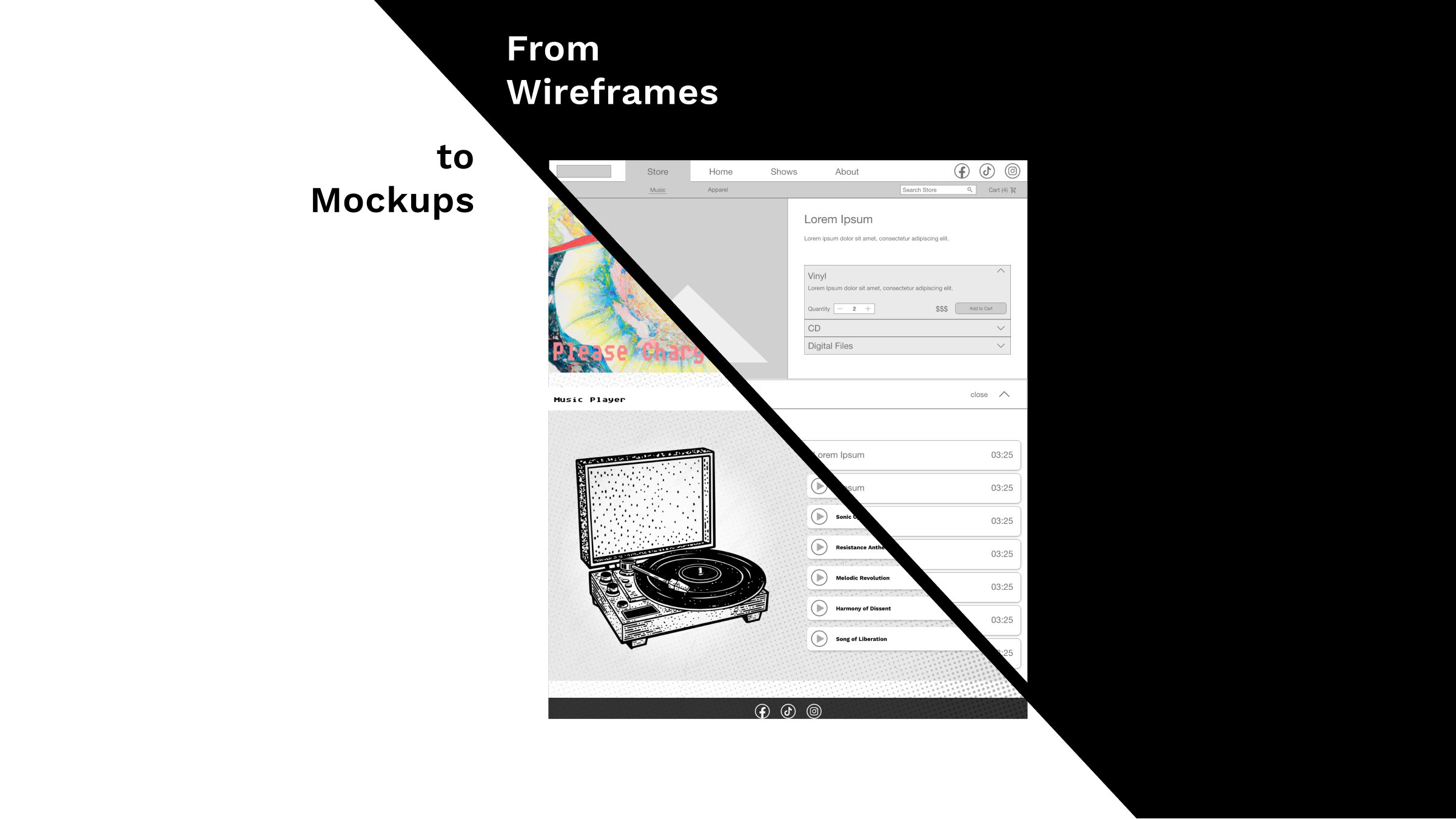
The final high-fidelity prototype follows the same user flow as the lo-fi prototype (home > store > album selection > add to cart > checkout 1-3).
Noteworthy changes are the optimized checkout flow, and cleaner navigation. The usability study was key to iron out navigation and checkout wrinkles.


